BAhons Graduate Collection

This is my graduate collection of patterns and print for interior surfaces. This collection is inspired by my journey to Milan in recent February, just before COVID-19 put the world on pause. Due to the pandemic, I have spent most of my final part of the degree, in lockdown. This has had a huge effect on how I work as a designer. Being limited to the tools at home and my laptop, it was a real struggle to develop the body of work I originally intended. However, I feel that I have overcome this personal problem, by going back to traditional drawing and painting, as well as my all-time favourite lino cutting. 

This collection is inspired by the botanical elements found in Milan Botanical Gardens, and throughout the city I was inspired by architecture and high end store furniture. I was also heavily influenced by wallpaper designers Christian Lacroix, Nina Cambel, Cole & Son and interior designers Anna Hayman, Avalana Designs, Harriet Popham. 

This collection is intended to fit within the dark interior trend. Bring dark saturated palettes alive in a space with vibrant and subtle prints. The collection is designed to be suitable for interiors wallcoverings, soft furnishings and hard natural surfaces, for example wood. 

My Growing Love For Dark Interiors

To me, dark interiors are mesmerizing and intoxicating. They have an interesting look and feel, and almost give that sensation of being wrapped up comfort and sophistication. I love how dark colours naturally draw attention to a space. Darker colours have a presence in a space and can make things seem much grander, giving that sophisticated vibe. 

Black interior grounds aren’t for everybody, but I believe with pattern and print to liven it up, the flat colour is a great way to change those views of dark being gloomy. If colours aren’t your thing, copper, gold, brass, and chrome all sing when placed against a black surface. 

Abigail Ahern

Leading the new world of dark interiors is Interior Designer Abigail Ahern. I have been following her blog about dark interior spaces and décor inspiration.

–> https://www.instagram.com/abigailahern/ <–

I also have been keeping updated with what Anna Hayman is up to, as she is also been recognised as being part of the dark interior movement, with her dark grounds and 60’s vintage luxe prints and material choices. 

Muck'N'Brass

Muck N Brass, which is founded by Zoe Pocock and based in London is a luxecycling brand that I have grown to love! They take old furniture and turn them into dark interior pieces of furniture with print and pattern, and elements of shine to really add to that elegant look. 

I love her whole concept of being sustainable in a fashionable way. not only is it fun and interesting but her products are unique and fits into parts of the dark interior trend.

Check out her Instagram page to see more and to keep updated with any workshops that she hosts.

–> https://www.instagram.com/mucknbrass/ <–

For my graduate collection, my goal is to create an assembly of small collections that are fit for dark interiors, with vibrant pattern and luxe finishings on wallcoverings, soft furnishings and hard materials. I am text block.

Designers That Currently Influence My Work

Harriet Popham

Harriet Popham is a great young designer who has inspired my work for years, and I have also been lucky enough to sit through a couple of her workshops taught at the University. She most definitely someone who breathes the joy of her work. Her prints are versatile, fitting into interiors/home ware/stationary/prints/commercial installation. 

Her work is mostly informed by travel and place, and her favourite being her family’s farmland home. This you can see through her quirky visualisations. She is a multi-disciplined illustrator, trained in embroidery and printed textiles with traditional and modern techniques. Recently Harriet has been working on creating large lino prints.  

Her work is always vibrant with colour and full of detail, such a joyful inspiration.  

I follow Harriet on a lot of her social media accounts as she’s always putting up new stories and images that are consistent within the theme of her work and memorising to view. 

her instagram account —-> https://www.instagram.com/harrietpopham/

My favourite pieces of work by her, would be the furniture with her tropical bird and city print.

Anna Hayman

I briefly met Anna at Clerkenwell Design week, May 2019. A very lovely and humble woman! She caught my attention instantly with her dark saturated coloured collection that she was exhibiting at the showcase. Her style is very dark luxe/60’s vintage/art deco, which is a growing unique trend. Since the brief meet at this event, I followed Anna on all her social media accounts to keep updated with what she gets up to now and her plans for the future, as I truly love her work and would love to build myself to her position in my future. 

Anna enjoys making her patterns through lino cutting, a traditional block printing method, then edited digitally for a clean coloured print. She is known for being part of the Dark Interiors movement, as along with the Interior Designer Abigail Ahern. 

I love her use of pattern and the way she constructs her repeats. Her work has inspired my own graduate collection, with bold prints, and dark saturated colours. Her material and final product are always to a high sophisticated standard, providing a luxe vibe with velvets, metals and natural materials, with interesting quirky repeats. 

Check out her Instagram also —-> https://www.instagram.com/annahaymandesigns/ <—- I absolutely love everything she posts!

Milano

After dealing with dreadful January, what better way to celebrate the new year than to take myself on a trip to Milan, the Capital for Fashion.

I personally am interested in the interior within these luxurious fashion designer outlets. There was so much pattern and material play in all the big names such as the Gucci Flagship store, which inspired my idea to maximise my prints.

I chose to gather imagery that caught my attention on my journey, and categorised them in 3 ways; Natural Botanical Form, Architecture, Objects.

I will use this research that I’ve gathered in Milan, to fuel my Major Project that will then be on display at my degree show. I want to develop a body of work with a final collection of design suitable for interior wall coverings and softer furnishings. my specific interior target will be the dark interior trend movement. Looking at the contrasting Scandinavian style interior with maximised print.

20-20-20

This was a peers collaboration , creating a special edition of 20 A3 prints, sold at £20. This Was to celebrate our graduation year being in 2020, at the same time that our Surface Pattern Design course turned 20!

the initial aim of this event was to come together as a large group to raise money for our future degree show in May.

I created my special edition print using a Lino relief print method, this was to translate my style, and add texture. Each print may have the same imagery, however they are each printed with slightly different hues and textures, as a block print can be unpredictable, and also depends on how I inked the Lino block. the colours range between forest green, royal blue and burgundy red.

My print was inspired by my journey to Cyprus in recent late  October. to hear about my journey check out my blog page –> ‘My Cyprus Odyssey’

Exhibiting  and setting up this little pop-up was a lot of fun! It was really nice to work as a team to make the event go through. The opening evening went extremely well, selling a large variety of prints, and celebrating with  lots of family and friends.

My Cyprus Odyssey

Hey! Here’s a little update on what and where I’ve been recently. CYPRUS!  I spent two weeks in Cyprus with my partner,  traveling the island, from sandy beaches, to waterparks to the top of the mountains. The country is was such a beautiful and inspiring place to be, it had my creative brain twitching with ideas for new and exciting  imagery.

I came back from my journey with a broad variety of research that I wanted to apply to a new project. This is when I came across the new 2020 I-Dott Wallpaper Competition briefs. There were 4 to choose from, but one of which I thought would be perfect to build a body of work towards, that also includes my research and imagery from Cyprus. The title of the brief was ‘A Captivating Conversational Design’. My personal response to this brief will be to recapture my journey of Cyprus, in exotic maximalist prints, suitable for interior wall covering and soft furnishings.

UPDATED; 13/01/2020

The last few months I have been working on building a body of work to this brief, with a final outcome design that is suitable for interior Wallcoverings, and matches the brief to capture conversation, to tell a story or contains a narrative.

I spent a lot of time painting in watercolour, which I then scanned to digitise into a working repeat.

Below if my final developed print 🙂

Exotic Paradise

Saving the next generations future

Orangebox was founded in 2002, in its origins of Hengoed in South Wales. They design and manufacture stylish and practical office/commercial furniture, that meet our wellbeing needs. Making social areas more comfortable and focus on connecting people.  

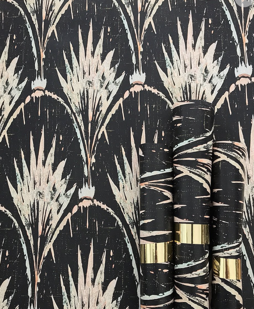
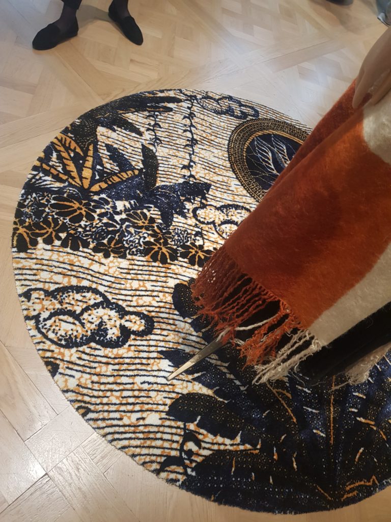
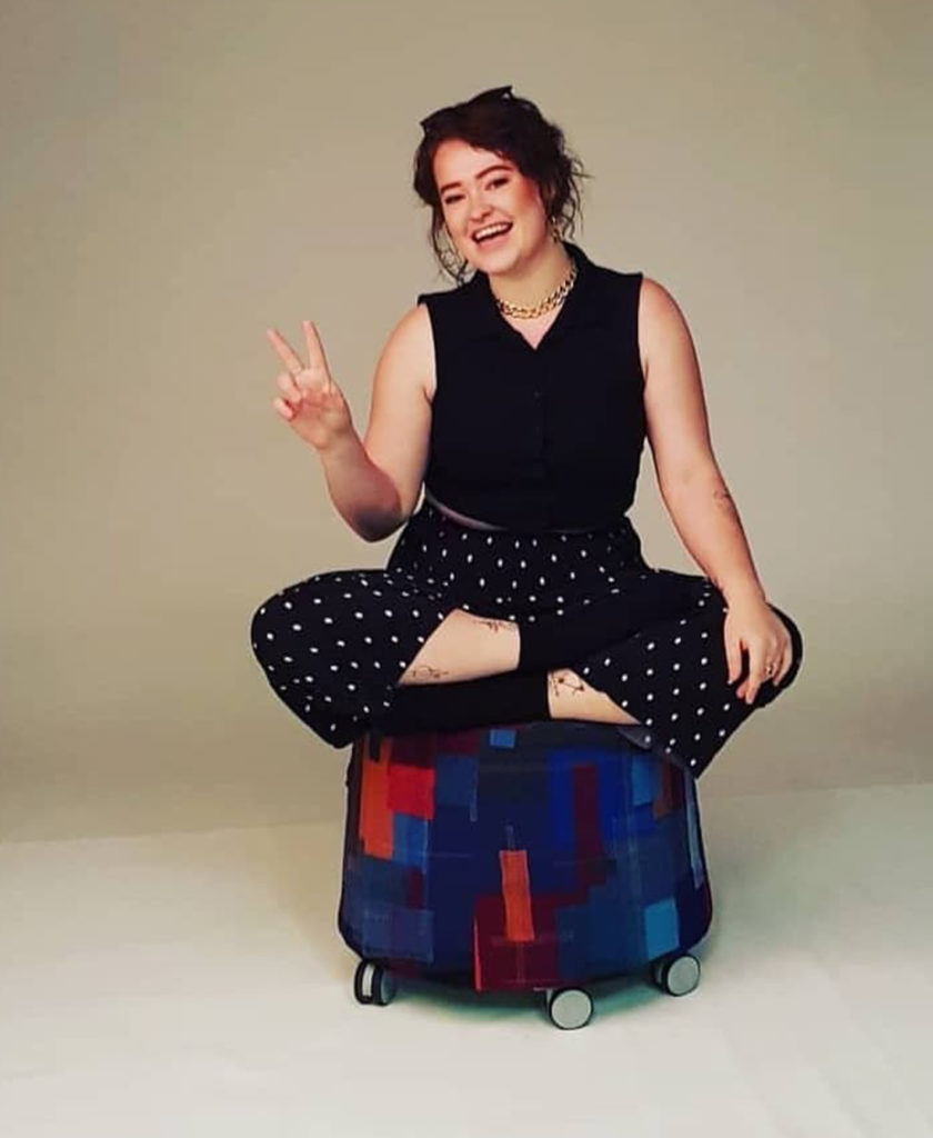
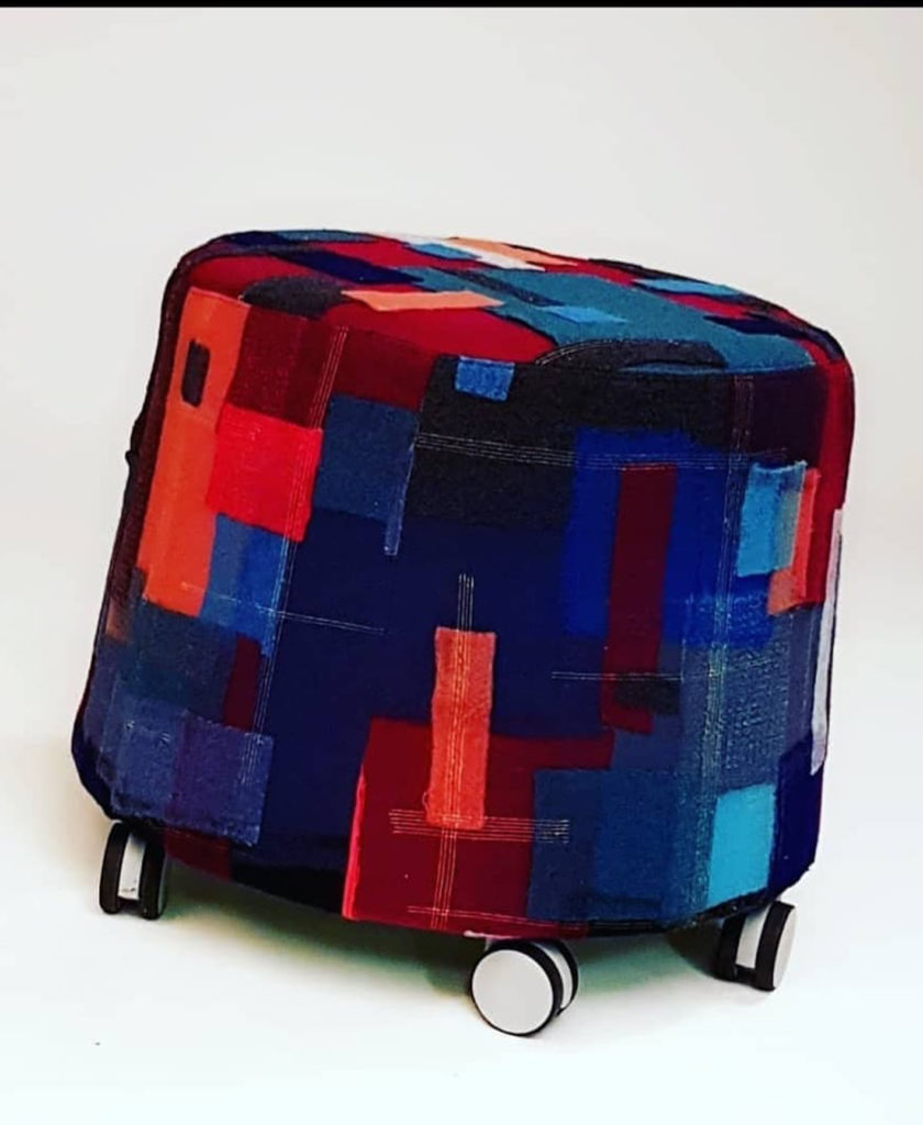
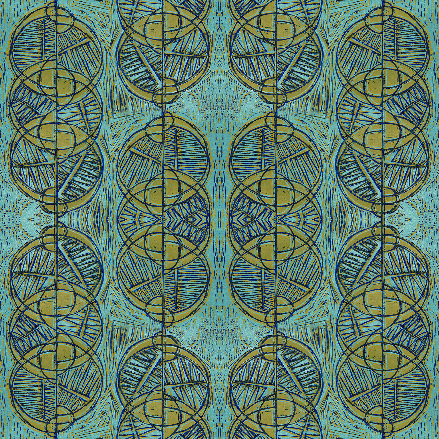
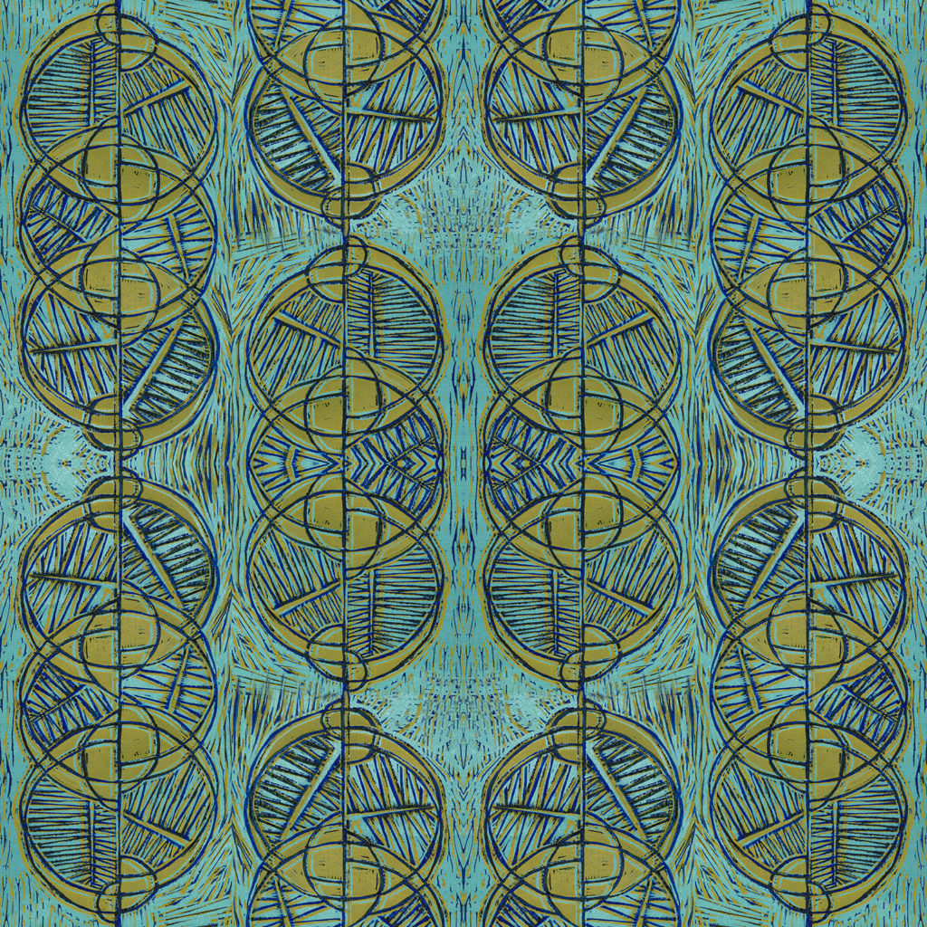
In my 2nd year on the course, we were approached by Orangebox with a brief, to help them tackle fabric waste in order to be a more sustainable business. The task was to take one days worth of waste; 44 sub straights of fabric cut, leaving a tone of offset waste a day. This was delivered to the studio, and as a ambitious surface textile designers, I worked on a plan to utilise as much waste as possible in a practical creative manner. The final outcome goal was to create a 5 panel pieces for a skimmer sully stool out of the waste provided. The initial brief given by Orangebox had suggested using biophilia and wellbeing as research and idea development. 

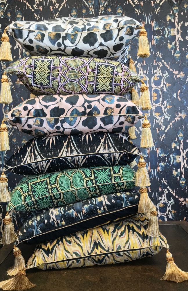
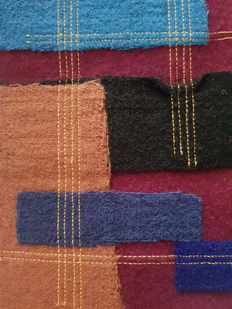
My initial réponse to this challenge was to identify the material, most of which was wool. My first action plan was figure a way to construct my panels from small cut offs. During my first year  on the course, I learned how to use an industrial embellishing machine. This could create new sub straights of fabric, by layering either wool or silk overlapping. the embellishment machine hold 900 needles that push up and down on the fibres, joining them together. I put my knowledge to good use during this project. I managed to create all 5 panels from small scraps of wool from the waste. the texture created from the embellishment machine lefts a soft fuzziness to the fabric, this ticked the box for my wellbeing challenge, as who doesn’t love to sit on a soft fluffy stool? the panels were also reinforced with a twin stick in random compositions, both vertical and horizontal across the panels.  

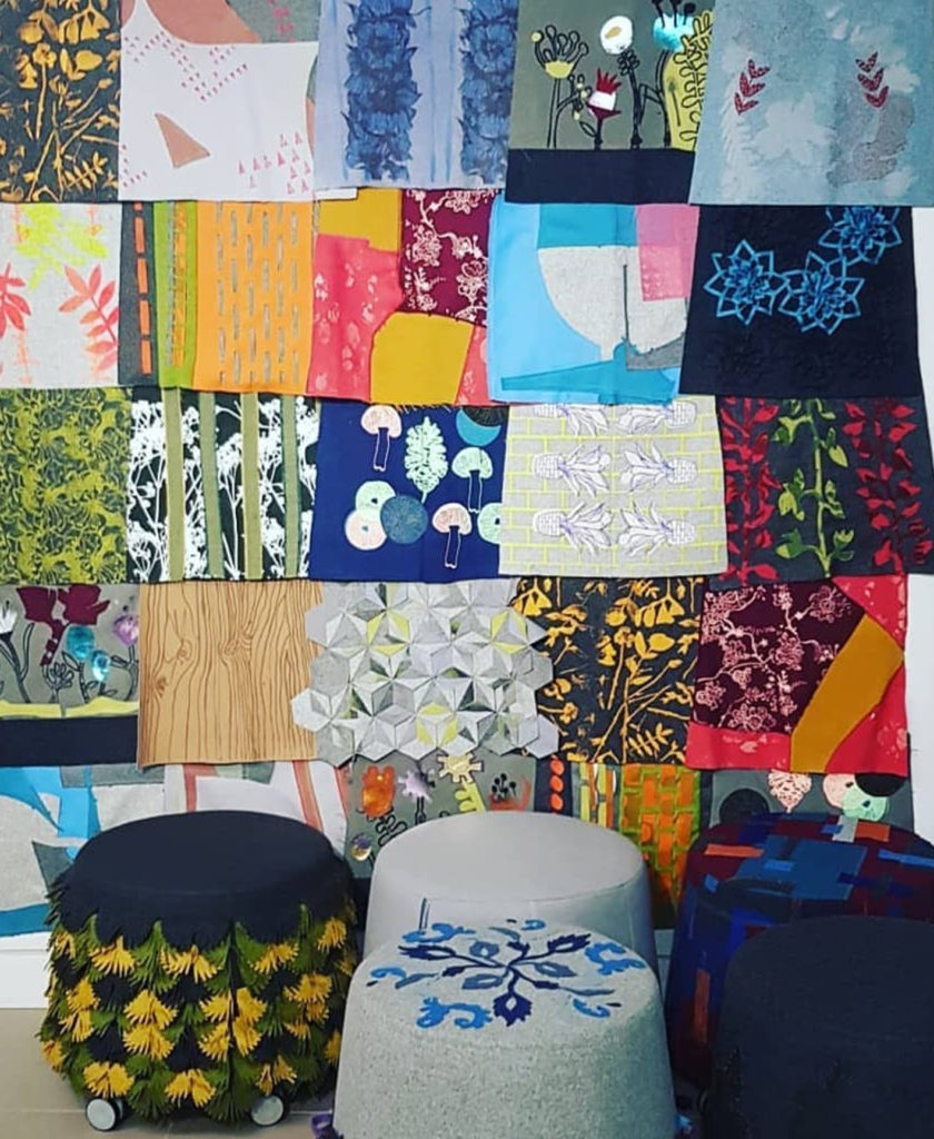
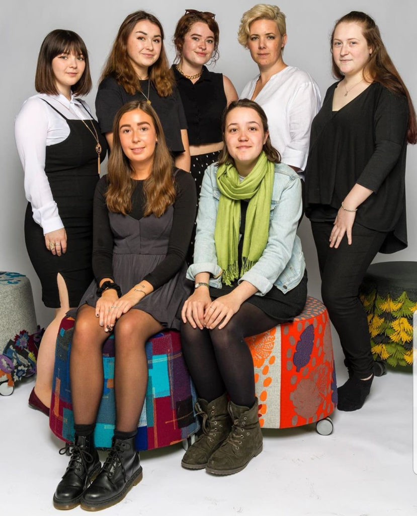
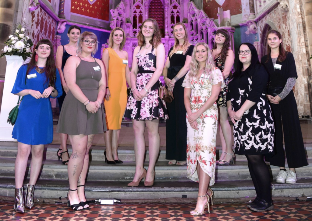
I was extremely pleased to fine out that my design had been chosen by the leading team managers, to be created up into a physical stool. This was very exciting and overwhelming, and to add to that excitement, they also announced ed that they would be taking the whole collection made by me and my university peers, to various design shows across the UK, including to London for the Clerkenwell Design Week, 2019, and we were invited. 

Having the opportunity to work with Orangebox on this collaboration has been such a new learning curve. I got to see what the industry looks like first hand from a tour, meet with the head of design and manufacturing teams, as well as having to work face to face with their teams. Having the chance to exhibit at Clerkenwell week was also a great experience, I had wonderful time at the Orangebox set up, as well as visiting other exhibitions for research and inspiration. The outcome has been more than expected, and a really great show. 

I-Dott Gala Dinner 2018

During my first year on the Surface Pattern Course, I had the opportunity to produce a body of work in response to a competition brief. The competition is called The I-Dott Wallpaper Competition, and involves leading designers and wallpaper brands in the industry to view new emerging talent. Every year theres are usually 4 different briefs to choose from, each have their own sponsors, which will also be deciding winning designs. 

For this year that I entered, I chose to study the brief ARTISAN. This was all about creating beautiful repeating wallpapers, from initial handcrafted artwork using traditional methods, which are then digitised into modern flawless patterns. I had the opportunity to explore various different methods of producing work with that artisan vibe. 

Through testing and experimenting, I found a love for Lino relief printing. This process of printing is much slower and time consuming, and very delicate. My design was inspired by the contrast of geometric structures with botanical forms, with research  directed by work of Martha Armitage and Lyubov Popova. 

after submitting my body of work for marking, and my design to the competition, I was very surprised and overwhelmed to hear that my design had been shortlisted, and then later found out that I had placed 2nd place in the ARTISAN category. This news for me was a massive confidence boost in myself as a designer, and fuelled my motivation to develop my skills and design knowledge further. 

The Gala Dinner event in The Monastery Manchester, where the award ceremony took place. Here I had the great opportunity to network with other upcoming designers from across the UK, as well as people from  design companies such as FineDecor.